
What is a balanced and neutral blue paint colour?

Review of Benjamin Moore’s Pike’s Peak Gray
When searching for a soft blue neutral paint shade, Benjamin Moore’s Pike’s Peak Gray is a standout choice that’s garnered attention in homes across Canada. It has been recognized for its balance between warmth and coolness and can be quite versatile: from sophisticated downtown Toronto condos to cozy cottages in Shediac, we’ve seen them take shape in different settings.
How would you describe BM Pike’s Peak Gray?
Pike’s Peak Gray is a mid-tone grey with subtle undertones of blue and green, creating a soothing and modern backdrop. Unlike many greys that can feel cold or stark, this shade manages to be inviting without leaning into beige or taupe territory. In natural light, Pike’s Peak Gray is quite crisp, while artificial lighting brings out its softer undertones, making it a chameleon-like colour that adapts to its surroundings.
Where do you like to use it?
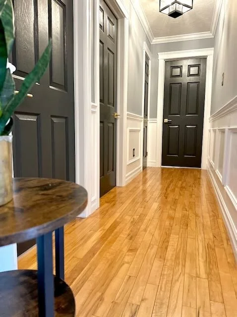
This colour is ideal for living rooms, bedrooms, and even kitchens, where you want to have a neutral transition but still create some character in the room. It pairs beautifully with both white trim and darker accent colours like navy or charcoal. We used Pike’s Peak Gray in a hallway this year where we were trying to create some texture and experiment with the trend of dark doors. We went ahead and created a chair rail and some boxes at the bottom using Benjamin Moore’s Chantilly Lace in a semi-gloss finish. The walls were painted in matte Pikes Peak Gray and really came to life when we took the plunge and painted the bedroom doors in Benjamin Moore’s Trout Gray, a dark blue, almost charcoal colour. We hung pictures on the wall and voila – we were in a totally different home as you can see with the before and after pictures below. Pike’s also works so well with the natural colour of the wood floor.


What did you learn about the colour when using it?
Peak Gray provides excellent coverage and consistency and applies easily with the roller. I also noticed that even with the kids running along the hallways and having to wash fingerprints often, the paint is durable and remains fresh-looking. However, it is a colour that can appear on the cooler side if you don’t pair it properly with the right complementary colours. This is where working with us at Luxe Paintworks as painters and interior designers can help – finding the right pairing is essential. When it is next to a crisp white, for example, it immediately feels warmer.
Any final thoughts on this colour?
I would say that this colour has a lot of personality. It adapts easily to its environment and other than your walls, I would also recommend it for cabinet and trims if you like a versatile grey with strong blue undertones. If you’re aiming for a modern, welcoming home environment, Benjamin Moore Pike’s Peak Gray is well worth considering.