
What is a versatile and elegant paint colour?

Sherwin Williams Drift of Mist has a solid spot in our book
If you’re on the hunt for a paint colour that’s both subtle and sophisticated, Sherwin Williams Drift of Mist deserves serious consideration. We’ve been using it in several homes this past year, recommending it not only for walls but for cabinets! A soft and warm greige that “saved the day” on more than one occasion.
What are the undertones of Drift of Mist?
If you’ve been reading this blog, you’ve heard me talk about the importance of understanding undertones. Why? Because you can’t avoid them. You need to pick which one you want to live with and will work with the rest of your home.
Drift of Mist is classified as an off-white with warm undertones. At first glance, it appears soft and light. However, after using it several times and in different locations, it has a cooler undertone that can pull some green under certain conditions. You may also notice a hint of beige at certain times of day, warming up the room and keeping it from feeling stark or cold. The best thing to do is always to test it in a few different locations and under different light - something we offer in our painting services.
Where should you use Drift of Mist?
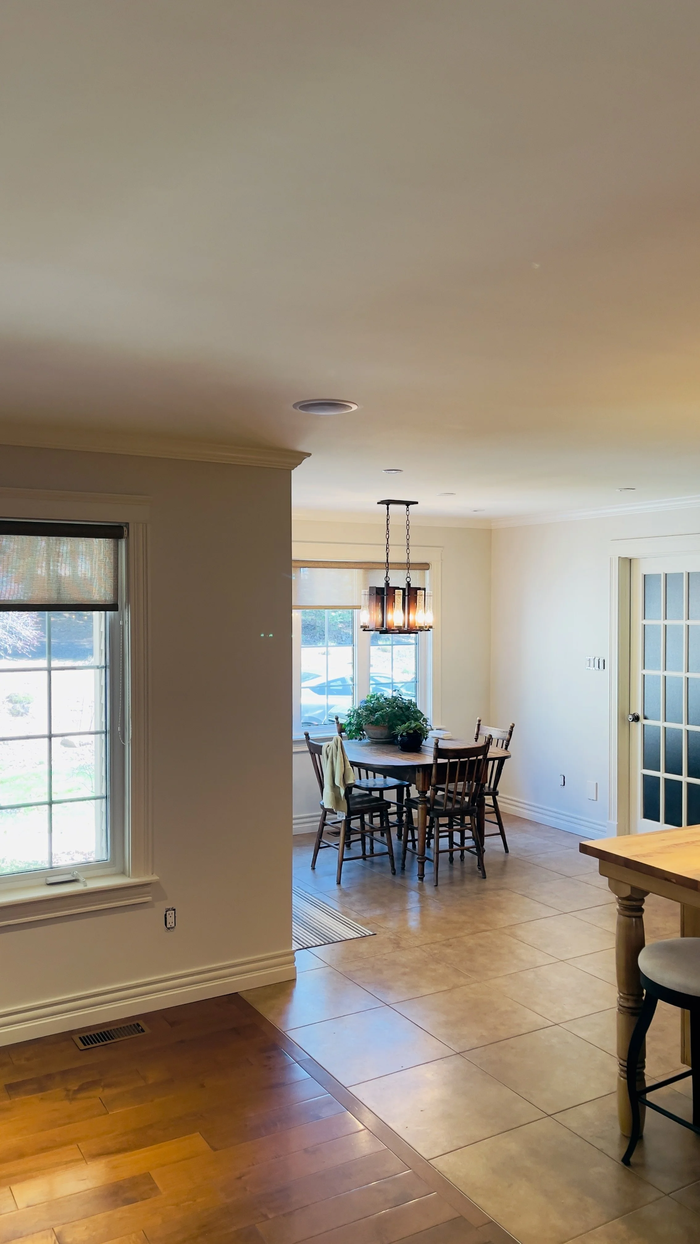
Drift of Mist is a very elegant and peaceful colour, I tend to recommend it in bedrooms and open concept living rooms. In small and closed-in rooms, the colour can look a little dungier so I like to keep it in spaces with lots of natural light.
I’ve also recommended it in kitchens where the owners had a lot of yellow going on (yellow wood cabinet doors, brown countertops) and didn’t have the budget for a full demo. By introducing Drift of Mist, you break the yellow and it opens things up quite a bit, creating a cleaner look - see pictures below. I would also recommend it as a cabinet colour.

Why do you like it so much?
What makes Drift of Mist stand out is its chameleon-like quality — it adapts so well to varying light conditions and surrounding colours.
Another advantage of Drift of Mist is its versatility. It pairs beautifully with a wide range of accent colours, from deep navy blues and forest greens to soft blushes and warm taupes. For a distinctly Canadian touch, consider pairing it with natural woods, slate tiles, or black hardware — a look that’s both contemporary and welcoming.
I thought grey was no longer trendy. Why do you keep using it?
Drift of Mist is considered a neutral colour. While it navigates towards grey and beige, it is not a true grey. It’s incredibly adaptable, either you are doing a new build or renovating an older house. Another thing is that while trends come and go, I tend to recommend colours that will last through the years, making it a smart investment for your home. While I love playing with what is trendy, at the end of the day, you should always pick colours that you love for your home and that suit your own vision. When you decide to work with us, we offer long-term solutions to transform your space the way you want it. Want to know more about our services? Make sure to contact us.